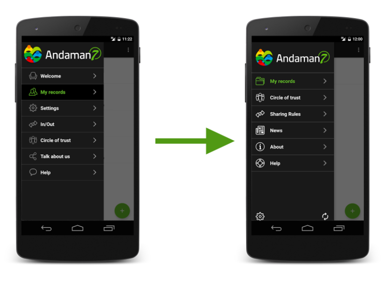
We have been collected lots of feedback from our userbase since the launch of the app. Many users felt like the first version of our main menu was too complicated and didn't put some of the most needed functions forward.
Well guess what... We listened to you guys! :)
We just launched our new menu! Available on iOS and Android
- Simpler, with less entries
- The "sharing rules" section has been added as requested many times
- The new "Help" section holds all links to our FAQ, support team and bug reporting
- The "Settings" menu is now accessible via a gear icon at the bottom left of the menu
- You can now launch a synchronization at any time directly by clicking the sync icon at the bottom right of the main menu. No more going deep into the app to send and receive medical information, it's right there with you all the time thanks to this new icon!
- The "Welcome" section becomes a news section where you'll discover the latest news about Andaman7
If you don't see the new menu in your app, you just need to update it to the latest version on iOS and Android
You like it? Let us know.
You DON'T like it? Let us know even more! :)

Recommended articles : New Update for all platforms & Version 2.0: Everything you need to know!


