Written by Lucie Keunen
Product Owner Andaman7
Android 2.4 - iOS 2.4
Description
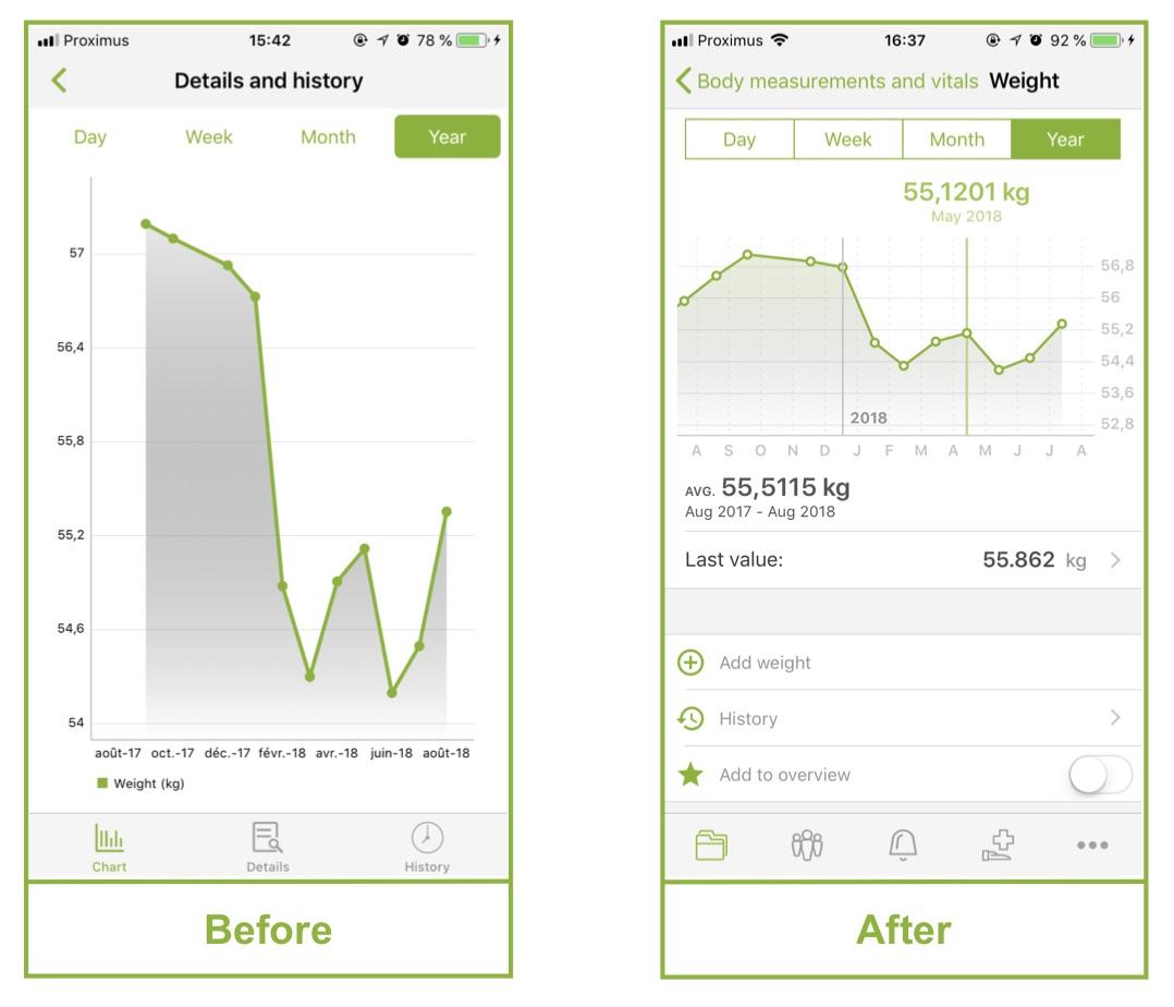
The visual aspect of graphs has been improved. They are also now embellished with a host of small pieces of information that makes reading them much more convenient.
Why is it important?
Graphs illustrate a set of data, enabling them to be interpreted quickly and easily. The improvements we have made make the graphs more readable and much richer: at a glance, you can monitor and watch the different parameters from your blood samples, your biometric parameters, etc. This is important because it gives life to your data; Andaman7 is no longer just a place for storing information, it now allows you to view the information in an easy way!
How does it work?
From a visual standpoint, the height of the graphs has been reduced to a fixed height taking half of the screen, which improves the proportions. The colors are lighter, and the graduations are more legible. Fine vertical lines have also been added to facilitate reading the information quickly.
Below the graph, you will find information such as average values for the period visible on the screen. The last entered value is also displayed, and you can quickly access it, to edit the details (date, unit, comment,...). Click on one of the plot bubbles to reveal other information; for example, on the graph plot “per year”, you can find the average values for the month.
Where can we see it?
All data that can be represented by a graph are now benefiting from these improvements. Go to one of the following sections:
- Measurements and vital signs
- Blood, urine, other tests
- Nutrition
- Physical activity and sleep
Then, click on one of the parameters to access the graph. (NB: If you have not saved any values for this parameter, you will first have to add one.)

Recommended articles : New feature Version 2.0 - Improved graphs & New feature - Charts


